
TGI Friday, and a sweet, extra-long Bank Holiday weekend for some of us! :)
I'm here today to participate in a fantastic blog hop to celebrate the launch of Paper Craft's best ever special issue yet (IMHO!) the Card Design Handbook!

Seriously, if you haven't got this issue yet then you *need* it! It explains basic design principles that, if followed, can make your projects shine! (Though there's a lot to be said for breaking some rules in style too of course! *wink*)
I'm so honoured to be a part of this hop! You should have hopped across from my fellow European peep, Lorena Cantó Lavería. If you haven't, then be sure to start here and get the full blog hop deets!
We've been asked to produce a 'Good to Great' card for our blog hop project. There are fantastic examples of this in the actual issue so I had a lot of inspiration! I also decided to feature on the design principle of movement/flow; that is, allowing the eye to rest and follow a design, taking in all aspects of the card with ease.
So first up is my 'Good'
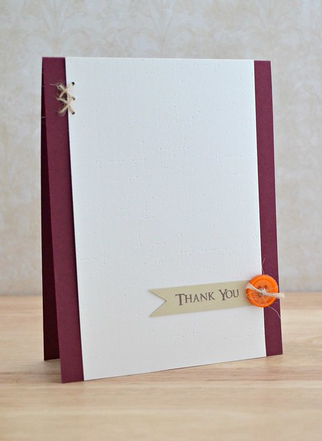
A very CAS card with an autumnal feel about it. What can I say? I adore autumn and I'm already getting a hint of it heading our way! :)
Nothing is exactly 'wrong' with this card but it's a little plain and lacking in energy. If I were to keep this design, I'd have to make the card smaller as I feel there's far too much space in proportion to my elements (I know, a CAS girl talking about too much space! Ha!) How about we add some autumnal leaves to this card to give it some oomph?
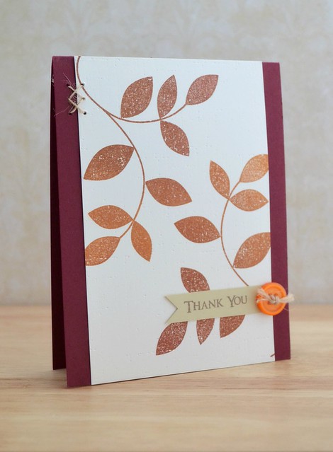
Ahhhh now this definitely has some more oomph! The leaves allow your eyes to take in the whole of that middle panel of card, without getting lost, as well as leading your eyes to the sentiment. The leaves also bring the design elements into proportion more, the card seems complete and actually looks smaller than the original 'good' card but I promise you they're the same size!
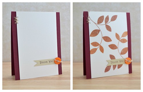
When the cards are side by side, you can get a real feel of the movement and energy those leaves give:
This card focuses on just one of the many design principles in the issue. This issue is like my design bible - it has pride of place on my
Before I dash I just want to thank Paper Crafts for not only publishing an amazing issue, but for inviting me to be a part of this amazing hop- thank you!
Now you've got some more hopping to do - remember to comment on each for a chance to win! Next on the hop is Emily Branch! If you're lost for any reason, you can find your way with the full list of participants:
Chan Vuong
Kalyn Kepner
Julia Stainton
Jocelyn Olson
Angeline Yong Jeet Leen
Jaclyn Miller
Lorena Cantó Lavería
Amy Wanford (you're here!)
Emily Branch
Vanessa Menhorn
Catch ya later!

Card Deets
{Thank You}
Stamps: Turning a New Leaf (Papertrey Ink)/Sentiment from Extra Time (Uniko Studio)
Ink: Rich Cocoa (Memento)/Autumn Sky (Adirondack - Ranger)
Cardstock: Scarlet Jewel, Vintage Cream (Papertrey Ink)
Accessories: Jute Ribbon Twine, Orange Button, Linen and Canvas Impression Plate (Papertrey Ink)
This is a fun hop with valuable lessons on the way. Great card. Visual lesson. Thanks
ReplyDeleteSimply amazing, Aimes! I'm too chicken to tackle a flow-movement lesson ;) xoxo
ReplyDeleteWOW, it's amazing the difference between both cards just with by stamping two images. Thanks for the ideas and the chance to win. Hugs, Joan
ReplyDeleteThis is the first card which I was able to see the issue: no movement! Yes those flowing branches definitely made the difference. The first card almost seems tense.
ReplyDeleteI like them both. The first one is beautiful in its simplicity of design, the other is more elegant. Love the use of the twine.
ReplyDeleteI love the addition of the leaves. Makes the card!
ReplyDeleteFabulous cards, love that bright orange button... and your fav texture plate :)
ReplyDeleteThat looks much better with the branches! I really like the colors that you used! :)
ReplyDeleteThe card is beautiful. I really like the stamps. Thank you for the opportunity to win.
ReplyDeleteabsolutely love everything about those leaves! the little touches of stitching are so pretty as well. :)
ReplyDeleteThat Book/Magazine is EXACTLY what I need!!!!!!!!!!! SUPER CARD!!!!!!!! :)
ReplyDeleteWow! What a difference!! Thanks for the chance to win!!
ReplyDeleteWOW - what a fabulous improvement! Definitely LOVE the added leaves!!!
ReplyDeletehousesbuiltofcards@gmail.com
www.housesbuiltofcards.blogspot.com
Great card. Truly enjoying this hop.
ReplyDeleteLove the addition of the beautifully stamped leaves!! Definitely moves the eye a lot better, thanks for the tip!
ReplyDeletegreat example!
ReplyDeleteStunning! Thanks for the lesson.
ReplyDeleteBeatiful cards. Great lesson in making the card from good to gear . Thanks so much for sharing!!
ReplyDeleteThanks for the tip and I love the card!
ReplyDeleteBoth cards are great! The first being calm and sedate (could be appropriate for a boss or co-worker) while the second is warmer and has more energy. Love them.
ReplyDeleteGorgeous!
ReplyDeleteLove the movement you created. A great lesson for us!
ReplyDeleteThose beautiful leaves are perfect for that card....wonderful example!!! Thanks for sharing!!
ReplyDeleteBoth cards have their appeal but especially like the movement with the leaves.
ReplyDeleteGood word--energy--I'm going to remember that--really makes a difference. Thank you.
ReplyDeleteLove the movement you created so easily with the stamped leaves. Beautiful card.
ReplyDeleteDramatic difference---this book is a MUST have!
ReplyDeleteWow learning so much today. I think I must have this book.
ReplyDeleteLOVE the extra added leaves. Much much MUCH better :D
ReplyDeleteYou are right Amy...I NEED THIS ISSUE!!! :) This tip "movement/flow" is probably the hardest rule for me to follow. I'm working on it tho!! Thanks for sharing your lovely cards!!!
ReplyDeletelove the different looks of the cards.
ReplyDeleteThe card with the flow certainly does look better, thanks for explaining the rules.
ReplyDeleteOh yes, the leaves make this a wonderful card! And turning them gives it a feel of movement - maybe like actual autumn leaves dropping? Thanks for the inspiration!
ReplyDeleteI'm really enjoying these lessons and am learning a lot. I like the 1st card just fine since I'm a CAS kind of cardmaker, but the 2nd one fits the bill, too, and really kicks it up a notch. Thanks for your lovely contributions.
ReplyDeleteI can't believe it is already time to start thinking autumn! I love the way you stamped the leaves on the second card...so gorgeous! Thanks for the chance to win :)
ReplyDeleteGreat card(s)!
ReplyDeleteDefinately the 2nd card
ReplyDeleteOh Aimes! I LOVE this improved card! Autumn is my favorite time of year and those leaves are just gorgeous! Definitely will be trying this trick!
ReplyDeleteThis card is gorgeous! I'm working on learning movement - I'm sooo not good with it. LOL
ReplyDeleteLOVE the sparkly leaves! Absolutely gorgeous!
ReplyDeleteThe leaves really do make a differnce. Love how they pull the whole card together. Thanks for sharing.
ReplyDeleteLOVE the difference the leaves make...thanks for the visual!
ReplyDeleteWonderful card, and thanks for the lesson. Tried to pin, but unfortunately, your images are not allowing pinning. Did you know that?
ReplyDeleteYup - LOVE it with the vines! It's SO much prettier and it flows nicely. Thank you for the example.
ReplyDeleteWow, love this remake. What a stunning card.
ReplyDeleteGreat cards =) TFS!
ReplyDeleteLove the addition of the leaves. The first was too simple!
ReplyDeleteI really like the addition of leaves in the second version. They are still simple.
ReplyDeleteMuch better. Thank you.
ReplyDeleteMuch better second card!! Love what such a simple leave stamp can do to a card background!!
ReplyDeleteKristan
sierrababy08 at hotmail dot com
Yeah, have to say the first card was really kinda yuck--no offense--I didn't even like the orange button with cranberry--the leaves make all the difference and turn it into a very lovely card! Have to remember to make "interesting" backgrounds when things are too simple.
ReplyDeleteFAB cards & explanation of movement within crafting. Love the rich colours against the white. Beautiful x
ReplyDeleteWow, big difference between the two cards. I'm a CAS kinda of gal too but I do agree that there was just a bit too much white space with the first card. But the second card is perfect. Just the right amount of elements to keep it interesting but not too busy. Thanks for the lesson and great examples.
ReplyDeleteI really like both cards, but I guess I can see how the second one is a better design. I think I really need a copy of this Card Design Handbook to help me learn better techniques. Thanks for the chance to win!
ReplyDeleteActually, I love them both Aimes! But the second one definitely has more 'finish' :0) Congrats on being included in a PaperCrafts hop - it feels just right seeing you in here!
ReplyDeleteWow -- the design element of movement really comes to life with your card illustrations! Those leaves just make such a tremendous difference.
ReplyDeleteFrom wow to WOW ... unless you like a lot of white space, but on this card the additional stamped image definitely takes it to another level! Thanks so much for sharing!
ReplyDeleteI really "love" the second card as opposed to really "liking" the first card! the second one is more eye-catching!!!!
ReplyDeletegreat lesson in color and design...would love to have a chance to win the issue!
ReplyDeleteI love the card with the leaves. It really does take it up a notch.
ReplyDeleteGreat design principle illustrated very well...love your cards!
ReplyDeleteLove!
ReplyDeleteYou know how to use "oomph!" to perfection! Thanks for sharing!
ReplyDeleteYou are right, the second card has energy to it! Great cards!
ReplyDeleteOoh what a useful tool, a card design handbook!! Your cards are a great example, easy to see the difference and WOW! what difference.
ReplyDeleteAdding the design really makes a difference in the card. It is much more interesting and pleasing to the eye.
ReplyDeleteWhat a difference! Love it.
ReplyDeletethanks for sharing the dramatic difference rule. It made a huge difference.
ReplyDeleteYou added just enough to the second card to make it interesting, but not enough to make it too busy. Very nice!
ReplyDeleteI love it! I can't wait for fall.
ReplyDeleteSometimes less is more but not in the case of the first card. What you added was very simple but was just the perfect touch!
ReplyDeleteCall me crazy, but I LOVE the first one!
ReplyDeleteGreat projects! I always get such fun ideas from these blog hops!
ReplyDeleteCarol B
ciaoitalia2007@gmail.com
What a big difference! I love your second version.
ReplyDeleteAbsolutely stunning-I gasped when I saw the improved version. This is what I call an "OMG" card-simply breathtaking.
ReplyDeleteWhat a difference some leaves make! ok I understand this now! Thanks for making it so clear.
ReplyDeleteDefinitely better with the branches.
ReplyDeletecathyplus5.blogspot.com
While I do like the super-CAS card, the leaves make such a difference while still being clean and graphic. Perfect example of good to great!
ReplyDeleteLOVE both cards! I think both are "great" cards!
ReplyDeleteFantastical sense of movement on that second card, dear!
ReplyDeleteAnd don't thank Paper Crafts - you earned it with your beautiful designs!
Now that is a huge difference!
ReplyDeleteNice card! I often have trouble finding these publications in my area, so I'm keeping my fingers crossed. :-)
ReplyDeleteThe leaves are a gorgeous addition!
ReplyDeleteThis is a great hop. Love all the visual re-enforcement..
ReplyDeleteWhat an amazing difference!~
ReplyDeleteI understand what you are saying but I like both cards - my eye is always drawn to the very simple yet elegant cards... thanks for sharing
ReplyDeleteSuch beautiful cards, Amy! I love a good CAS card and yours is awesome. The inking on the second card is stunning!
ReplyDeleteooh, i'll be stalking the book store for this bad boy!
ReplyDeleteThanks for making a great way for us to see needs something to has something... the second card HAS it! Thanks for sharing and hope you enjoyed the holiday over there :)
ReplyDeletelove the leaves simple but elegant
ReplyDeleteThe before felt a little bare to me. So glad you added the leaves!
ReplyDeleteBig difference, love the flow onthe second card. The 1st was OK, but was missing that movement. Thank you for sharing and a chance to win.
ReplyDeleteYou definitely showed us a great example of movement in card making. Thanks for the inspiration. :D
ReplyDeleteThe leaves really make an improvement.
ReplyDeleteslrdowney at hotmail dot com
Wow it is amazing how those leaves really made your card pop. Thanks for the lesson and inspiration
ReplyDeleteYes, the fall leaves was just "the thing." Thanks for sharing this lovely card and for the chance to win.
ReplyDeleteWow it is amazing that just adding those leaves could make your card really pop.
ReplyDeletePercilla G
Wow what a difference. Thanks for sharing!
ReplyDeleteThe second card really is lovely.
ReplyDeleteYour first cards didn't look finished. I definitely prefer the 2nd card. Thanks for sharing.
ReplyDeletethe first card is nice. Anyone can do but card #2 Wow! That really shows off what you're made of.
ReplyDeleteThanks for the great tips!! Beautiful card :)
ReplyDeleteLove them both but the second card seems an improvement to me. Love it! This was a valuable lesson. Thanks!
ReplyDeleteWow, what a difference in your cards! I definitely need to get this book! TFS
ReplyDeleteStriking difference - goood example of the Concept! :-}
ReplyDeleteLynden
http://aneleganttouch-lynden.blogspot.com
https://www.facebook.com/pages/An-Elegant-Touch-/162889457132788
wow this is amazing and you explanation of what you did and why really allows us to see where you are coming from. I will be buying this if I don't win it!
ReplyDeleteThis second card is great. The leaves make such an amazing difference.
ReplyDeleteThis book looks really fantastic. Thanks for the chance to win.
What a difference those leaves make...really leads the eye to the sentiment, and you don't miss out on your lovely hand stitching!
ReplyDeleteVery nice! ...
ReplyDeleteReally like the addition of leaves for the "great" card!
ReplyDeleteThe autumn leaves really make the difference on this card. Great idea.
ReplyDeleteThis blog hop was worth it, so many things that I have learned to put in practice right now!
ReplyDeleteLOVE the leaves! THanks for the chance to win!
ReplyDeleteI SOooooo need that book!
ReplyDeleteVery sweet cards--the addition of the leaves does help you "travel" through the card. Also, I like your use of the twine as it also helps draw the eye from one point to the other! Thank you for sharing.
ReplyDeleteBoth are great, but I actually like the one with all the white space better. I think the texture of the cardstock gives it enough interest for it to stand on it's own without a stamp.
ReplyDeleteGreat improvement in the 2nd card. Now I love that sketch and might have to try it with some other stamps to see if I can work the same magic!
ReplyDeleteLove the second one! The leaves are gorgeous!
ReplyDeleteDeniseB
Love,love, love your great card! The addition of the leaves is awesome!
ReplyDeleteHi! I really want to get this book! I love the ideas!
ReplyDeleteWow the one without the leaves really does look bigger. What a difference the leaves make. Thanks for sharing.
ReplyDeleteAnother lesson that I need to learn. I love seeing the cards side-by-side - it really helps me to understand (and hopefully to improve my own work!). Thanks so much!
ReplyDeleteis it aweful to say I wouldn't mind either one? I think the stitching stands out more in the first, but do favor the second only because it's more interesting. But I guess I would consider the first ULTRA CAS vs regular CAS in the second.
ReplyDeleteThose leaves are stunning!!! I love them!
ReplyDeleteALWAYS LOOKING FOR FAST CARD TO MAKE. GREAT IDEA.
ReplyDeleteSuch helpful hints along this hop. The leaves on your second card make a world of difference! TFS :)
ReplyDeleteGorgeous transformation! Can't wait to get ahold of this issue!
ReplyDeleteGreat. TFS. Thanks for the chance to win.
ReplyDeleteGreat card! Thanks for these design tips! ;-)
ReplyDeleteAutumn is my favorite season too and I love the fall leaves that you added to the CAS card. It really did make it pop and flow.
ReplyDeleteThanks for sharing! If I win, my soon to be worn and dog eared copy of the Design Handbook will have a place of pride on my messy desk as well! :-)
Great movement in your card!
ReplyDeleteFabulous...just loving the orange this year!
ReplyDeleteGreat example Aimes and I def need a copy of this issue!
ReplyDeleteAmy, thanks for showing and explaining how to achieve movement in a card! Loved seeing how the addition of leaves made such a difference to your gorgeous card!
ReplyDeleteboth are very pretty card. love the colors and stamping
ReplyDeleteThanks for being part of the blog hop. Love the way you added movement to your card with the flowing leaves. Beautiful Autumn card! Great lesson for me. Thanks for the chance to win this terrific book!
ReplyDeleteOH, Duchess...2 gorgeous creations and love how you talk about them...nothing like a pop of orange to wake up the senses! I've got this issue on my nightstand! LOL Not surprised you are in the hop...they could have called it the Duchess edition with all your gorgeous cards! Hugs!
ReplyDeleteWhat a huge difference!! I love the 2nd card!!
ReplyDeleteI love your cards!
ReplyDeleteThe second card is much improved. Very pretty. Thanks for sharing.
ReplyDeleteWow! It really made a big difference those Autumn leaves!
ReplyDeleteNice lesson on movement/flow. Nice cards, especially like the second one. Would love to have this magazine on my craft table!
ReplyDeleteCorrine Ann
Fabulous Aimes!
ReplyDeletei do like the 2nd one. that is a great lesson!
ReplyDeleteBoth cards are fantastic! I love the addition of the leaves! So perfect for fall!
ReplyDeleteTFS this great design tip! I love CAS but I don't always know how to pull it off!! Thanks for showing us side by side examples!
ReplyDeleteWow, I can really see what you mean by "flow". Thanks for the great example cards!
ReplyDeleteBeautiful job! I liked the first one, but WOW to the second
ReplyDeleteYes, that definitely makes a difference to the eye. Loving these lessons, can't wait to put them in action in my own projects. Thanks!
ReplyDeleteLovely fall colors! I think this card is fantastic.
ReplyDeleteGreat designs and imagination. Love the way that you develop an idea to make it stronger.
ReplyDeleteSuch AMAZING and FUN cards!! LOVE the tips and tricks!! THANKS for sharing and for the chance to win!! Have a FABULOUS WEEK!! =)
ReplyDeletecool
ReplyDeletei love the leaves' branch. nice card for fall too! TFS
I understand what you are saying but I have to admit the Zen simplicity of the first card speaks to my soul.
ReplyDeleteThe movement of the leaves definitely adds an extra oomph! :)
ReplyDeleteWow! I can see the difference!!
ReplyDeleteThey both look great to me! :)
ReplyDeleteThis is amazing! The flow concept is illustrated so beautifully- the eye naturally follows the image to the sentiment. Love it!
ReplyDeleteThere's no need to choose me as I already have a copy but I love what you did with the leaves, especially when they look like they are changing colours toward the middle of the card. Fantastic!
ReplyDeleteMissed this post somehow, nothing like photos of the before and after to bring home the effect. I actually like both cards.
ReplyDelete